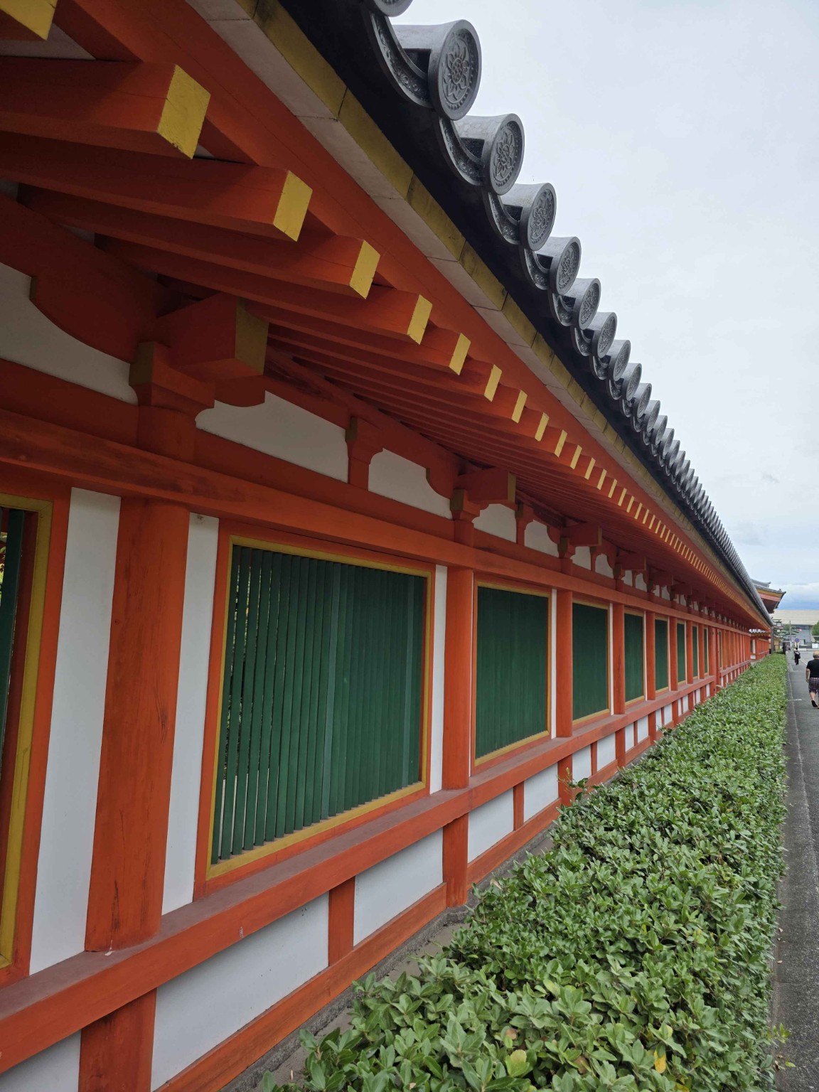
Walk through an old temple or shrine in Japan and you may notice the same colors again and again: vermilion-red pillars, deep green doors, white walls, and touches of yellow or gold.
To a visitor, the combination raises an obvious question. Why these colors?
Were they chosen because they were easy to make from nature? Did red have a protective meaning? Or is this simply what traditional Japanese religious architecture was supposed to look like?
The answer sits at the intersection of religion, mineral chemistry, architecture, and cultural exchange across East Asia.
- First, these are pigments—not simply dyes
- “Vermilion” does not mean one chemical
- Green could literally be the color of copper
- Yellow and gold were not necessarily “easy” colors
- Was red used to ward off evil?
- Not all Japanese shrines are red
- Ancient Japan may have looked much more colorful than we imagine
- Japan’s old buildings are also records of materials and technology
- Sources
First, these are pigments—not simply dyes
When people think of traditional colors, plant dyes often come to mind. But architectural color works differently.
Wooden buildings were generally colored with pigments: finely divided, insoluble particles applied to the surface with a binder. That makes temple and shrine colors a kind of historical materials science.
Japan’s Agency for Cultural Affairs explains that full-scale architectural polychromy developed in Japan alongside the introduction of Buddhism from the Asian continent. Over time, the techniques were adapted and became part of Japanese building traditions as well.
“Vermilion” does not mean one chemical
The most striking color is often red.
One famous traditional red pigment is cinnabar, a mineral composed mainly of mercury sulfide (HgS). Japan has a very old history of using cinnabar. At the Wakasuji-yama cinnabar mining site in Tokushima, cinnabar was mined from roughly the late Yayoi to early Kofun periods.
But a red building was not necessarily painted with cinnabar.
Traditional red pigments also included:
| Appearance | Traditional material | Main chemical component |
|---|---|---|
| Bright red | Cinnabar / vermilion | HgS |
| Red to reddish brown | Bengara | Iron oxide, mainly Fe₂O₃ |
| Orange-red | Red lead | Pb₃O₄ |
This distinction matters.
A study by the Tokyo National Research Institute for Cultural Properties examined red material remaining on roof tiles and other finds from 31 temple-related archaeological sites dating from the Hakuhō to Nara periods. In the investigated samples, the architectural red was classified as iron-based bengara, rather than mercury vermilion or red lead.
So when a building looks “vermilion,” we cannot identify the original pigment by color alone.
Green could literally be the color of copper
A classic traditional green pigment is rokushō (緑青).
Mineral greens made from malachite contain copper compounds; malachite itself is a basic copper carbonate, commonly written as Cu₂CO₃(OH)₂.
Material studies of Japanese cultural properties, including the Takamatsuzuka Tomb murals, have identified mineral green and blue pigments such as malachite-derived green and azurite-derived blue.
Seen this way, a red-and-green building is more than a visual contrast.
It can also be a meeting of different elements: iron, mercury, or lead on the red side; copper on the green side.
That makes the building itself a kind of large-scale historical material sample.
Yellow and gold were not necessarily “easy” colors
Yellow could come from mineral materials such as yellow ochre, while gold could literally mean gold leaf.
The important point is that “natural” did not mean “cheap” or “easy.”
Minerals had to be mined, selected, crushed, refined, sorted by particle size, mixed with a suitable binder, and applied by skilled workers. Gold required even greater resources.
A brightly colored religious building therefore represented more than decoration. It could also display wealth, technical skill, and authority.
Was red used to ward off evil?
Red and vermilion have long been associated with ritual, sacred boundaries, protection, vitality, and authority in East Asia, and protective interpretations certainly exist in Japanese religious culture.
But the familiar explanation that “shrines are red because red wards off evil” is too simple.
Architectural color arrived as part of a much larger system that included Buddhist art, building technology, materials, ritual, and styles transmitted through China and the Korean Peninsula.
Color also had a practical side. Traditional coatings and decorative finishes could help protect wooden surfaces from weathering.
In other words, the color had symbolic, technological, architectural, and practical roles at the same time.
Not all Japanese shrines are red
Another useful correction is that vermilion is not the universal color of Shinto.
Some shrine traditions place strong value on unpainted wood. Ise Jingū is the most famous example: its architecture is strikingly different from the vivid vermilion image many overseas visitors associate with Japanese shrines.
Japan therefore has multiple architectural color traditions.
The bright red-and-green palette is important, but it should not be mistaken for a rule that applies to every shrine.
Ancient Japan may have looked much more colorful than we imagine
Today, many old temples are associated with dark timber, muted browns, and weathered surfaces.
That creates a powerful aesthetic, but it can also distort our picture of the past.
Historic Buddhist buildings and artworks used combinations of red, green, blue, yellow, white, and gold. Centuries of sunlight, rain, abrasion, repainting, restoration, fading, and loss have changed what survives.
So the quiet brown beauty we now associate with an “old Japanese temple” may sometimes be the beauty of aging rather than the appearance its builders originally intended.
If we could walk through some temples immediately after their construction, they might look surprisingly vivid to modern eyes.
Japan’s old buildings are also records of materials and technology
The original question sounds simple:
Were red, green, and yellow used because those colors were easy to obtain?
The answer is almost the opposite.
The palette was built from mineral resources, technical knowledge, skilled labor, cultural exchange, religious meaning, and sometimes considerable wealth.
A red pillar can point toward iron or mercury chemistry. A green door can point toward copper minerals. A flash of gold can reveal both artistic intention and economic power.
The next time you visit a temple or shrine in Japan, it is worth looking beyond the color itself.
What looks like decoration may also be a record of geology, chemistry, trade, religion, and technology.
Sources
- Agency for Cultural Affairs, Japan — Architectural polychromy: https://kunishitei.bunka.go.jp/heritage/detail/304/6
- Tokyo National Research Institute for Cultural Properties — Survey of red pigments on ancient temple materials: https://www.tobunken.go.jp/joho/japanese/publication/nenpo/2005/pdf/200531.pdf
- Agency for Cultural Affairs — Materials used in the Takamatsuzuka Tomb murals: https://www.bunka.go.jp/seisaku/bunkashingikai/kondankaito/takamatsukitora/rekkachosa/03/shiryo06_1.html
- Agency for Cultural Affairs / National Cultural Properties Database — Wakasuji-yama cinnabar mining site: https://kunishitei.bunka.go.jp/heritage/detail/401/00004085